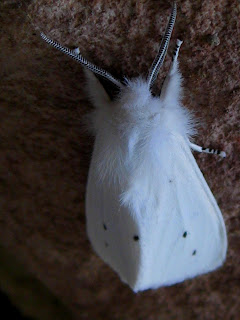
The poem “Design” by Frost had a focus on one specific prominent image. The most prominent image in this poem was the color white. The color white was associated to the other images of the poem including the moth , spider, and the silk. The spider was also a prominent image, appearing to be more of the secondary focus of the poem. The moth, silk, and witch’s brew were subtle images use more to be methods of contrasting with the color white.
The spider in the poem is talked about man times in the poem first being fat and white, then a snow-drop, and then finally kindred. Overall, this image does not change, it is just described numerous times in the poem.
Because the color white is so dominant in this poem, it seems like it is meant to be a symbol for how looks can be deceiving. Generally, white is a shade of purity, innocence, peace, and cleanliness. The images that were white in this story, the moth and the spider represented the opposite, aggression and survival. Because the spider was white, the author compared it to a flower, a delicate object and the moth to a white satin cloth. In reality, a moth being held by a spider could mean that the spider is having a meal, essentially sucking the life out of the moth.
Also. The color white describes the majority of other images in the poem, especially the idea of a white heal-all. It is contrasted with death and darkness and night from other images that comprise the environment of the poem. This could be interpreted, as images that appear to be pure can be dark by nature in the presence of darkness. Destruction can occur from objects no matter what the color or size according to the author.
No comments:
Post a Comment